
Graph Properties
In order to customize graph functions and views, use the Graph Properties window. Here, changes to the graph properties can be made, such as adjust which products are displayed, change scales, choose axis labels, plot qualifiers or reference lines, and even add graph notes on the Graph Properties window. The Graph Properties window is very useful for making the graphs unique and fit specific user needs for a certain type of graph.
To open the Graph Properties window, simply Double-Click on the graph to customize it
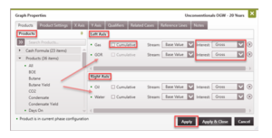
Products
The Products Tab allows selection of products to display on the graph. Products are added on the side of the graph specified (left or right axis). The corresponding products’ units will be displayed on the selected axis as well.
The Available Products are divided into three categories:
·Cash Formula – These are formula-based products that use inputted prices, revenues, expenses, taxes, and investments to solve for the fiscal values and make those available for plotting. Some examples of cash formulas are:
·OpexFixedCosts
·NetInv
StateTaxOil
Products – These include products that are actually produced by the well/case, formula-based products, and other well properties. Some examples of products are:
- Oil
- Gas
- Water
- Water-Oil Ratio (WOR)
- Total Wells (Well count)
Test Products – Test Products are values measured or calculated by performing well tests (build-up, draw-down, etc.) on the case and can be plotted on the graph. Some examples of test products are:
- BHP/Z
- Test Gas
- FTP
The graph is a very useful tool for plotting a variety of products using specific layout. From the Products tab, different graphs can be set up to plot things like:
- Gross Production (monthly or cumulative)
- Net Production (monthly or cumulative)
- The input prices or expenses entered for a product
- Revenue or expense streams for any product (gross or net)
- Combined (All revenue and expense streams)
- Test Products
- Results of cash formulas
To choose which products are displayed on the graph
- Double-click on the Graph to open the Graph Properties and go to the Products tab.
- The list of available products is displayed on the left pane. There are three products categories: Cash Formulas, Products, and Test Products. The green dots indicate products that are in the current case’s Phase Configuration. To add a product, drag it from the available Products list to the section on the right to display it on the left or right axis. A maximum of six products can be displayed at the same time on the graph: three on the left-axis and three on the right-axis.
- The default settings plot gross values.
For volume & cash formula products
- Cumulative – Check the box to show cumulative values, otherwise monthly values are plotted.
-
Stream – The default setting is Base Value which is equivalent to product volumes or cash formula results. To plot revenue, expenses, etc., for the specified product, change the stream as appropriate using the drop-down menu.
Interest – The Interest can be Gross, WI, Net, ORRI, or ECL (depending on the interest type you want to visualize). The default interest is Gross. Other options are:
- WI – Working Interest
- Net Interest for the stream – this is usually working interest for expenses and revenue interest plus royalty interest for volumes and revenue
- ORRI – Royalty Interest
- ECL Interest – this is usually 100% for expenses and the Lease NRI for revenues
For test products – choose the completion from which to plot the data.
- Click Apply to save the changes.
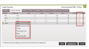
Product Settings
To change the display settings for products on the graph
- Click on the name of any Product on the Y Axis to open up the Graph Properties window on the Product Settings tab. (Or double-click on the graph to open Graph Properties and go to the Product Settings tab.)
- Adjust these settings for any product that is currently plotted on the graph by selecting from a drop-down or checking the box for the product.
History Display – change the style of the line for historical volumes to Lines, Points, Points+Lines, etc.
End Point Label – add a label with the product name at the end of the history or forecast (whichever is later)
Plot Daily – plot daily volumes that are input on the Daily Production form.
Plot History – plot volumes from Monthly Production form. This is the default setting. If unchecked, historical volumes are not plotted on the graph. It is recommended to leave it enabled; some users disable this for printing.
Plot Forecast – plot the forecast for the product on the graph. This is the default setting. If unchecked, forecast segments are not plotted on the graph. It is recommended to leave it enabled; some users disable this for printing.
Smooth – apply a smoothness factor to the historical production data.
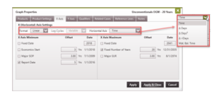
X Axis
To change the format and scales of the X Axis
- Double-click on the graph to open the Graph Properties and go to the X Axis tab.
- At the top, change the X (Horizontal) Axis Settings:
- Format – Can be plotted in linear or log cycles
- Log Cycles – For Log plots, you can choose the number of log cycles
-
Horizontal Axis-The default units are Time and can only be changed to something else if there is historical production on the case. The Horizontal Axis parameter set could be useful to model flow regime or just to display the temporal component of the data. The options available are:
-
Time – Calendar year. Use this to display as Date (example 1/1/2021, 2021, 21, etc.)
-
Δ Days – Delta Days from Start of Production
-
Δ√Days – Delta Square Root Days from Start of Production
-
Δ Days² – (Delta Days from Start of Production)²
-
Material Balance Time (MBT) – Cumulative volume of production to a given date / the rate at that date. So, for oil this would be:
bbl / (bbl / day) = Days
(In this instance, bbl cancels out, leaving the unit as days. Then, convert MBT from Month to Days by standardizing on 30.4375 days per month, because 365.25 / 12 = 30.4375. Plot the rate as a function of MBT.)
- Next, set the rules for the X Axis Minimum and X Axis Maximum. From here, check as many options as needed for the minimum and maximum dates. The program uses the earliest (or min) or latest date (or max) and use those as the dates displayed on the horizontal axis. All options other than fixed date allow for an Offset to be entered. For rate-time graphs, the min and max dates are specified. The offset can be entered as a negative or positive value, however, PHDwin interprets an offset for minimum to mean subtract from specified date and for maximum to mean add to specified date (Min – offset and Max + offset). Hence, if Economics Start Date (say is 1/1/2003) is selected, a 3 year offset, the minimum date for the graph is calculated as 1/1/2000. The options are different for rate-cum and log rate-time graphs.
Minimum Date options:
- Fixed Date – specify the four-digit year greater than 1799. PHDwin assumes 1/1/yyyy.
- Economics Start – Link to the case economics start date.
- Major SOP – Link to the first date of production of the case’s Major Phase.
- Report Date – Link to the Report Date set for the Scenario.
Offset – For some options checked, an offset can be specified. The actual X Axis Minimum is the selected date less the offset. For example, setting the date as the Report Date (which is 1/1/2021) with an offset of 5 years sets the X Axis Minimum as 1/1/2016 (see image below).
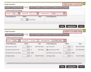
Maximum Date options:
- Fixed Date – specify the four-digit year greater than 1799. PHDwin assumes 1/1/yyyy.
- Fixed Number of Years – The number of years after the X Axis Minimum. Enter the number of years, the entire length that the horizontal axis extends.
- Major EUR – Link to the date the production reaches the EUR of the case’s Major Phase.
- Offset – For some options checked, an offset can be specified. The actual X Axis Maximum is the selected date plus the offset. In the image below, a 20-year model is being set up. The Fixed Number of Years offset of 20 years means the total length of the X axis is 20 years beginning from 1/1/2016 to 12/31/2035. For rate-cum graphs, the min and max volume are specified (note: volumes are usually major phase volumes). The offset can either be negative or positive, however, PHDwin interprets an offset for minimum to mean subtract from specified volume and for maximum to mean add to specified volume (Min – offset and Max + offset). So, if Economics Start is selected, the minimum is the cumulative volume up until the case start date less any specified offset. If a 20% offset is specified, the minimum cum set for the x-axis is when 80% of the volumes up until the case start date have been produced. If 50,000 bbls of oil have been produced by the case eco start date, a 20% offset means the x-axis starts at 40,000 bbl.
Minimum volume options:
- Economics Start – Link to the case eco start volume (usually major phase volume at eco start).
- Earliest Product SOP – Link to the production of the first product produced from the case.
- Fixed X Axis Cum Value – Specify a fixed volume to serve as the minimum on the x-axis.
- Report Date – Link to the scenario report date (usually major phase volume at scenario report date).
Maximum volume options:
- Fixed X Axis Cum Value – Specify a fixed volume to serve as the maximum on the x-axis.
- Latest Product EOP – Link to the production of the last product produced from the case.
- Report Date – Link to the scenario report date (usually major phase volume at scenario report date).
- X Axis EUR – Link to the EUR of the product.
For Log Rate vs Log Δ Time, the number of Log Cycles is the variable being selected, which affects the min and max X Axis values.
-
Log-time and Log-cum graphs
Y Axis
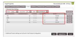
To change the format and scales of the Y Axis
- Double-click on the graph to open the Graph Properties and go to the Y Axis tab.
- At the top, change the Y (Vertical) Axis Settings using:
- Format – To plot in linear or log scale.
- Log Cycles – For Log plots, select the desired number of log cycles.
- Scale – Volumes can be plotted as monthly (volume/month) or daily (volume/day) rates. If volume/unit is selected, the rate for a given month could be divided by:
- Days On – divides monthly volumes by a specified Days On value if present
- Calendar Day – divides monthly volumes by the calendar day of the corresponding month
- Normalized Month – divides all monthly volumes by the average days in a month (365.25/12)
- Then, set the scale for each product on the Y Axis:
- Variable – Check this box to allow PHDwin to automatically change the units of the product so that the minimum is never over a value of 1,000. As a result, if the minimum value of gas production is 1,000 scf/month, the minimum becomes 1 Mcf/month, with the updated unit.
- Fixed units – If preferred, set the Y Axis Minimum and Maximum manually by unchecking the “Variable” option, selecting the appropriate unit, and set the range of y values as desired.
- Rescale – Click the rescale button to do a one-time rescale of any product. This automatically sets the Y Axis Min and Max based on the production on the case. This is a handy option when unsure on how to set the scales.
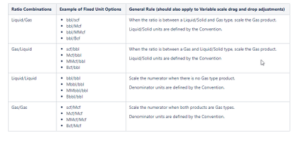
Adjustable units for ratio products on graphs
The table below shows the different units for displaying ratio products. To set units to the values specified in the table for a given ratio product, uncheck the box under the Variable column and use the drop down under the Units column to select the appropriate unit for the product. If you are unsure on what unit is appropriate, leave the Variable column checked to allow PHDwin determine the right unit for you.
Qualifiers
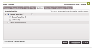
To plot multiple projection qualifiers on the graph:
- Double-click on the graph to open the Graph Properties and go to the Qualifiers tab.
- Put a check mark next to the qualifiers to plot the data. A maximum of six qualifiers can be displayed at the same time on the graph. Note: the top level qualifier for the current scenario will be in bold and has to be displayed/selected.
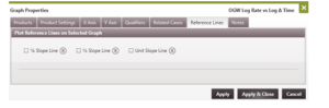
Reference Lines and Flow Regime Shaded Regions
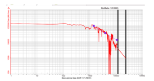
If the historical data is plotted on a log-log plot where the units of the horizontal axis are Delta Days or Material Balance Time, the flow regime of the well can be determined. This cannot be seen on semi-log rate time plots. Knowing the flow regime can help to improve the accuracy of production forecasts. In most cases, the slope of a line that fits along the historical data points will dictate the state of the well.
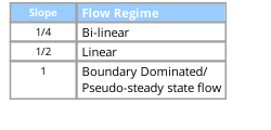
PHDwin can plot these Reference Lines (with 1/4, 1/2, and Unit slope) to help determine the flow regime of a well at different points in time. Drag and drop the Reference Lines on top of the historical data to see the best fit. This helps to identify one or more flow regimes on the well. Once the best fit Reference Line to the historical data is drawn on the log-log plot, the Reference Line indicators are drawn on the rate-time plots. With this, it becomes easy to adjust the forecasts knowing the points in time when a well is in Transient or Boundary-dominated production. If necessary, separate projection segments can be used to model/forecast the production for each flow regime.
To Turn On/Off Reference Lines on the Graph
-
Open a rate-time graph and double-click on the graph to open the Graph Properties. To turn on the Reference Lines, the graph must have these settings: a. On the X Axis Tab – Set the Horizontal Axis format to “Log” and set the Horizontal Axis units to Delta Days or Mat. Bal. Time. b. On the Y Axis Tab – Set the Vertical Axis format to “Log”.
-
Go to the Reference Lines tab.
-
For Reference Lines, select:
- Plot it on the graph
Click the 🗑️ button to clear the Reference Line data.
-
After drawing the lines on the graph, use the handles to drag and drop to best fit them on top of the data being used. Not every well will have each flow regime, so adjust the settings to only plot the lines that match up with the historical data available.
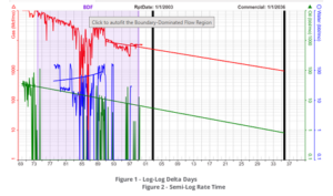
Flow Regime Shaded Regions
Once a Reference Line is applied to a log-log plot with ether Delta Days or Material Balance Time on the X Axis, a flow regime shaded region will appear in either semi-log or rate-time graph. These Reference Lines allow you to select or match the data points that fit within a given flow regime and the shaded region will then appear on the plot for that range of data. PHDwin allows you to auto-fit and generate a forecast based on the data points that fall within the shaded region. This is accomplished by clicking the flow regime at the top of the graph.
- Other considerations while using Reference Lines
- If the well data or history that you have only indicates that the well is in early Transient flow, you
should often assume that the well will enter Boundary-dominated Flow at some point. Transient -
Flow often doesn’t last for the life of the well. To determine the point at which the well does switch flow regimes, you can look at comparable wells in the same general area and determine the decline rate at which they went into Boundary-dominated Flow. This might mean taking an average or going based on other experiences. You can also use reservoir simulation models.
Once you have determined the time at which you will switch to Boundary-dominated Flow, you can create a forecast with an appropriate b factor. Fetkovich has recommended appropriate b factors for different reservoir types, for example an acceptable range for a gas well in Boundary-dominated Flow is 0.4 – 0.5, and an acceptable b factor for a solution gas oil drive in Boundary-dominated Flow is 0.3. If you have more enough data however, you would just fit the curve. You can also use a b factor of 0 to be more conservative.
If the well that is shown has multiple flow regimes, you do not need to worry about creating a projection or forecast on top of both the Transient Linear Flow and the Boundary-dominated Flow. You would just find the time at which it switched to Boundary-dominated Flow and make a good fit from that point forward.
Material Balance Time is cum production divided by rate. Plotting rate vs. Material Balance Time can sometimes help to clear up odd data caused by operational upsets, however it can also sometimes make those upsets look like a well is in Boundary-dominated Flow when it in fact is not.
If data is noisy this won’t always work, there will be a delay in seeing the start of a straight line.
Notes
Notes can be added to the graph and are displayed at a fixed position on the grid or attached to a product. See Graph Notes for details.